Timeline
2 months
Team
Product operation, 4 engineers
My role
Live-page audit, component system design, mobile-desktop auto-mapping logic, asset playbook and team handover
Babel tower revamp.
Fewer components, better defaults: rebuilding the page builder behind Joybuy's campaigns.

Context and challenge
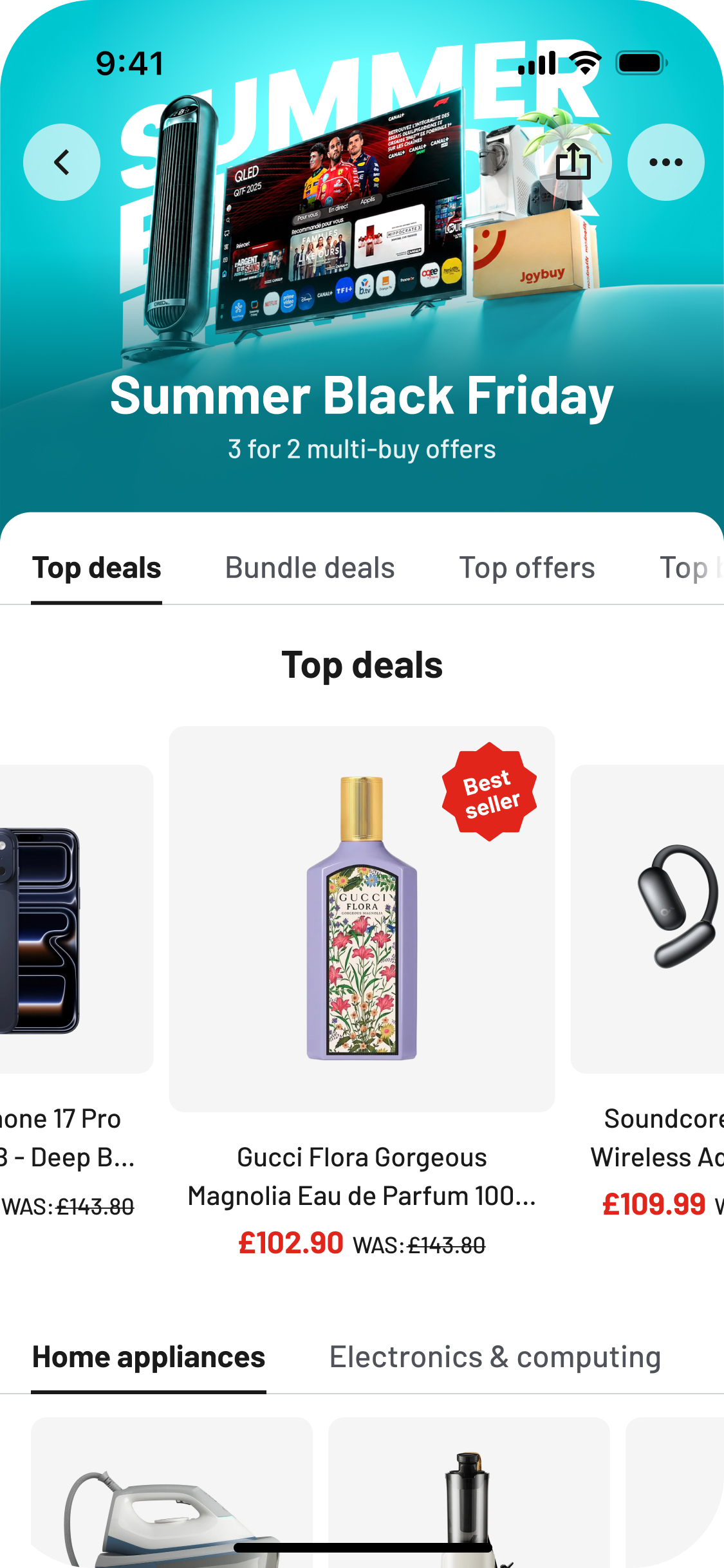
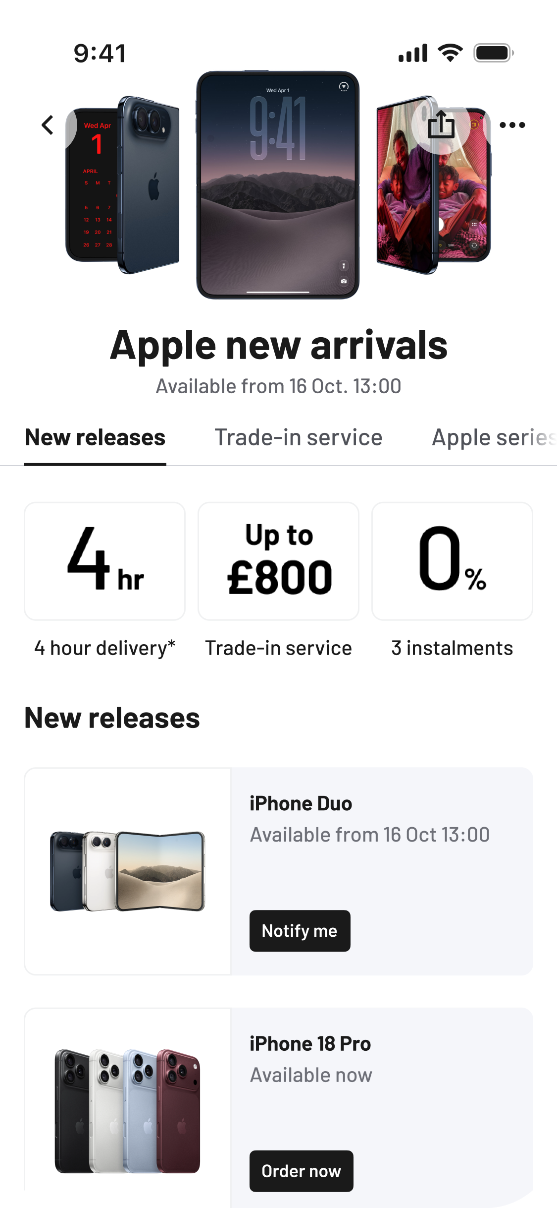
As the internal page builder Joybuy's marketing team uses to assemble campaign pages across UK/EU markets, Babel’s component picker used to hold ~60 components, and the pages it produced looked inconsistent from market to market. The system made the wrong thing easy:
Too many components doing the same job.
Marketing spent time choosing between near-duplicates, and pages drifted apart.
Copy baked into images.
All components were uploaded as finished artwork with the text already inside. Screen readers couldn't read it, search engines couldn't index it, and translation meant re-designing and exporting artwork rather than editing text.
Design decisions were left to whoever built the page.
Padding, corner radius, colour and font size were exposed on every component, so each page was effectively redesigned by the person configuring it.
Usability audit of TCL flagship store
As-is vs to-be audit.
with an SEO and Core Web Vitals audit across 4 markets.
Component convergence.
Role-based mapping of the legacy picker.
Component redesign.
Merged legacy components rebuilt around one role each with layout variants.
Global rules.
Live text, spacing, and colours that lock design decisions at the system level.
Mobile ↔ Desktop auto mapping
Logic that derives desktop from one mobile configuration.
Playbook and handover.
Asset playbook for marketing ops and creative designers.
I led and contributed across:
CMS-to-frontend blueprint: configuration decisions & live experience impact
Why SEO & as-is audit
A campaign page serves as a perfect platform for optimising SKUs via SEO, provided it is designed for crawlability. Hence I ran a comparative analysis between the current state and the proposed improvements, followed by an SEO and Core Web Vitals audit across all markets.
Every page was built on the same template, which makes almost every defect I found systemic. This reframed the project: fixing a component once would fix it on every future campaign page.
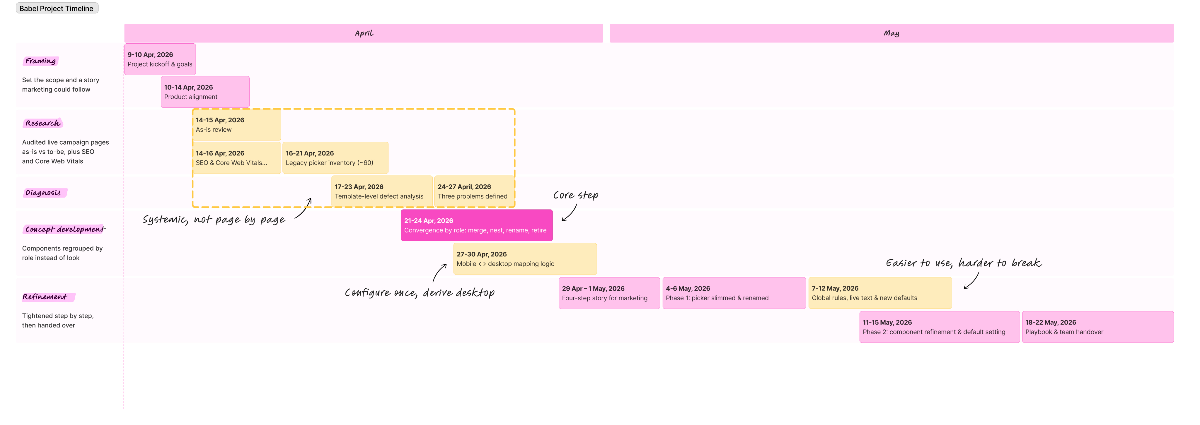
Babel revamp timeline
Before
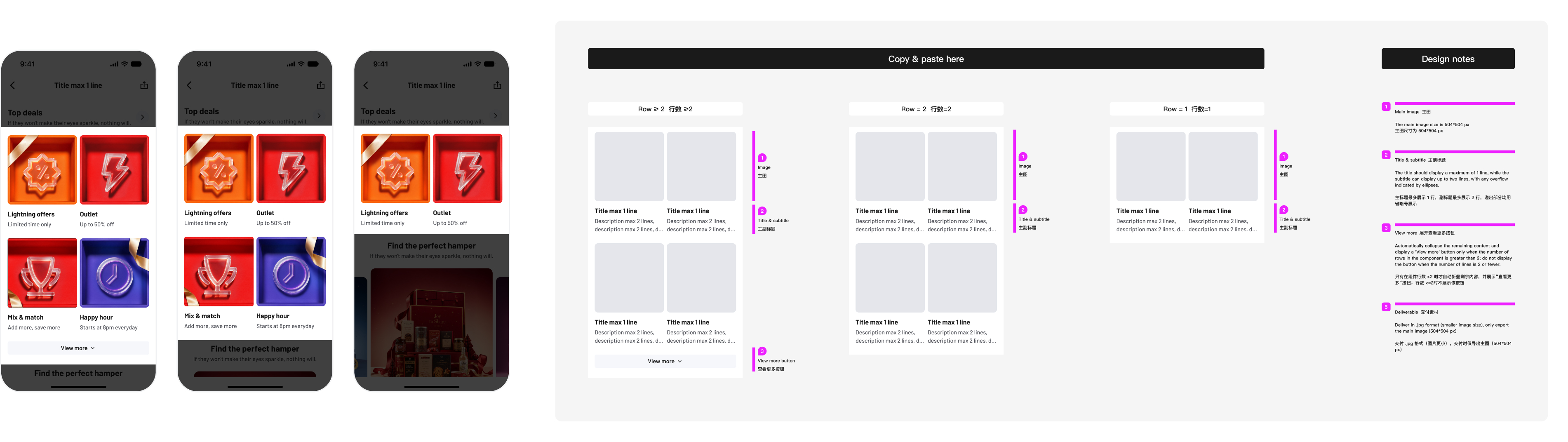
Babel assets playbook – image card grid component set
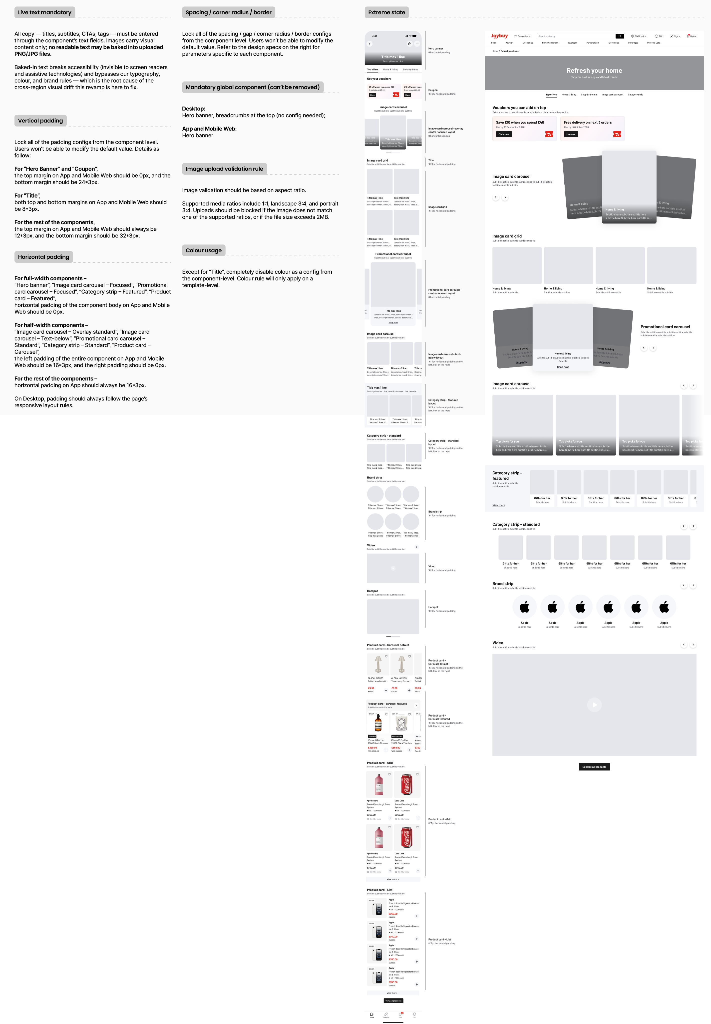
[Right] My three-dimensional discovery framework.
Key insights
The hardest part was taking freedom away instead of the design itself.
Marketing had always been able to configure everything, and the revamp tightens almost all of it: components, parameters, and eventually colour. The real work was stakeholder communication, building a narrative that brought marketing on board.
In a page builder, the defaults do most of the design work.
Most pages go live with whatever a component ships with. Changing a default, such as switching the Hero banner to immersive style or turning the SEO switch default from off to on, changes every future page without training anyone.
Text in images is more of a component problem than people problem.
While I can't prevent end users from misusing components, I can modify them to minimise misuse. I've implemented forced copying into live text and phased out "hot zone" components that allowed entire sections to go live as a single uploaded image.
Process and approach
Tightening step by step, with a story marketing could follow.
Instead of taking everything away at once, I framed the revamp as four steps: retire, reorganise, set defaults, refine. Phase 1 only slimmed down and renamed the picker… Colour, the most visible freedom, stays open for now and was tightened gradually over 3-6 months.
Converging by role instead of look.
I gave every legacy component one of four actions: merge, nest into another component, rename, or retire. Merges followed three steps: recognise components that play the same role, split that group by interaction mode rather than visual style, then turn the remaining visual differences into properties (Type and Layout) instead of separate components.
Configure once, derive desktop
Marketing configures pages on mobile, and desktop is derived automatically. I defined when each layout can map to desktop and what happens when it can't: some layouts need a minimum number of cards or rows to fill the desktop width, some mobile components share a same desktop component.
Solution and outcomes
A much smaller, role-based component set
Card collection is the clearest example. 9 legacy components became 3: Image card grid for browsing, Image card carousel for exploring, and Promotional card carousel for conversion. Each now has a few layouts instead of a separate component for every look.
Making the system easier to use and harder to break
I simplified setup by reducing repetitive module combinations and introducing clearer hierarchy and usage rules. Since storefronts were configured by non-design teams, I also made the templates more fault-tolerant, so the system could handle edge cases and inconsistent usage without breaking the experience.
A playbook, so the system doesn't live in my head
For a long time, I was the only designer in the team that holds all of the Babel knowledge, which is why I packaged the revamped components into an asset playbook for marketing ops and creative designers, covering exact image sizes, safe zones, copy limits and export rules, following by a knowledge-share session for the broader team.
Impact & metrics
Operational efficiency
~3 fewer revision rounds between marketing team and creative designers.
45% reduction in product-team involvement per campaign page setup (marketing teams self-serving).
Component system
56% reduction in components for page builder
90% increase in current campaign pages passing accessibility checks
Page quality
Share of campaign pages passing accessibility checks
Time to build a campaign page, or revision rounds with marketing
© Olivia Forster, 2026