Timeline
3 months
Team
Design lead, product manager, 2 engineers
My role
Early research & discovery, storefront design, CMS tooling logic design, product design and handover
Shop-in-Shop.
A scalable storefront system that gives global brands the flexibility to make Joybuy their own.
Context and challenge
At the start of the project, Joybuy UK had 150+ brand partners, but fewer than 20 active SiS (Shop-in-Shop) storefronts. The issue was not brand acquisition, but the weak setup flow and backend capability that made many storefronts difficult to launch:
Brands were onboarded, but storefronts were not going live efficiently.
Storefronts were built by merchandisers and then sent to brands for approval. Pages often went through multiple revision rounds and stayed inactive.
The backend could not support brand expectations well enough.
Joybuy’s operation backend lacked the flexibility and control needed for stronger branded content, making setup slow and approval difficult.
Usability audit of TCL flagship store
Solution and outcomes
A clearer storefront architecture
I reorganised storefronts into clearer layers: branded header, hero banner, guided entry points, product/category discovery, trust and service content, brand story, and editorial support where relevant.
Introducing a tiered SiS template
I introduced two storefront tiers: a PLP-based entry tier for a lower-cost, faster launch, and a custom tier with richer hero, discovery, and storytelling for higher-priority brands — covering both quick activation and flagship experiences.
Scope of MVP.
Brand partner requirement synthesis and prioritisation.
CMS template logic.
Module governance rules and content system principles.
Information architecture. Module hierarchy, navigation logic, and content strategy.
Key insights
The system needs to support different levels of brand and category complexity.
Inactive storefronts did not reflect low demand. They reflected a one-size-fit-all system that could not yet support what different brands and customers actually needed.
CMS design has to account for misuse, not just ideal use.
I believe a flexible CMS-supported system is inherently open to misuse – modules combined inconsistently, overused, or pushed beyond their intent by non-design teams. Fault tolerance becomes a core design requirement: instead of designing for ideal scenarios, I focused on making modules more resilient, adaptable, and scalable under real operational use.
CN and EU SiS follow fundamentally different browsing logic.
Working in a cross-border team, I had to convince stakeholders that the CN SiS logic they’re familiar with could not simply be reused for EU users.
CN shoppers branch off exploratorily from almost any module; EU shoppers rely on focused, guided paths by need or use case. With discovery research, I made that gap visible to stakeholders and shift them away from reusing CN logic for the EU model.
Process and approach
Building a three-dimensional discovery framework
I structured the early research around three lenses: localisation discovery, brand discovery, and user feedback discovery. This helped me frame it through user pain points, European market expectations, and brand partner needs.
Synthesising signals at scale with AI
To ground the work in real user behaviour, my co-worker Olly Boon↗ and I used AI to cluster ~7k reviews to surface trust, brand, and shopping friction themes, which helped surface recurring themes around trust, brand presentation, and shopping friction.
Turning research into an MVP system
After building the initial skeleton of the three discovery tracks, I mapped the findings into an MVP direction for SiS. From there, I translated the insights into category-specific storefront logic, tiered templates, and CMS governance rules that could work in real operational use.
Early-stage discovery.
UK/EU benchmark research and CN vs EU SiS analysis.
Category-specific logic.
Storefront patterns across electronics, toys, beauty, etc.
Cross-functional collaboration.
Across product, engineering, merchandising, and business.
I led and contributed across:
Impact & metrics
CMS-to-frontend blueprint: configuration decisions & live experience impact
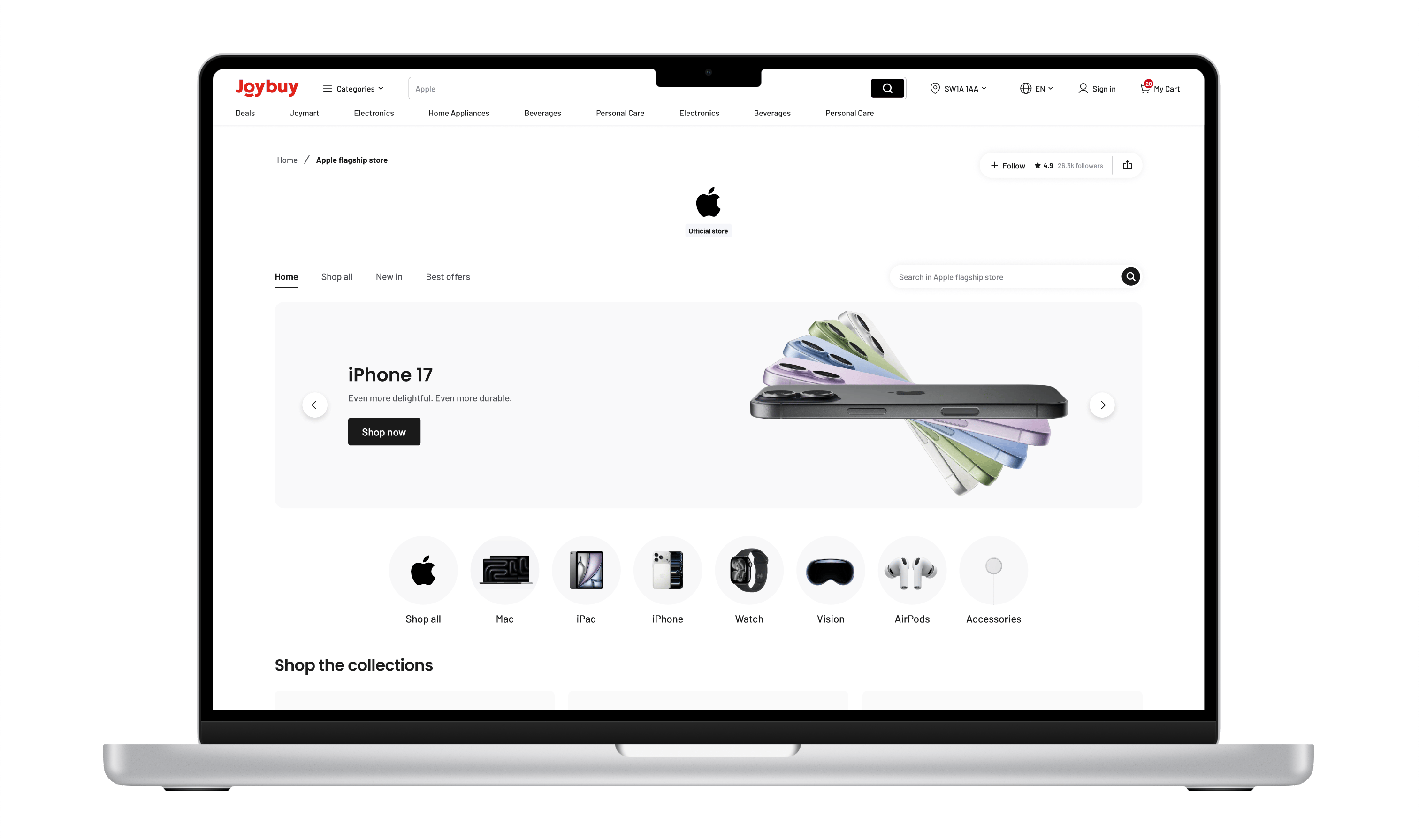
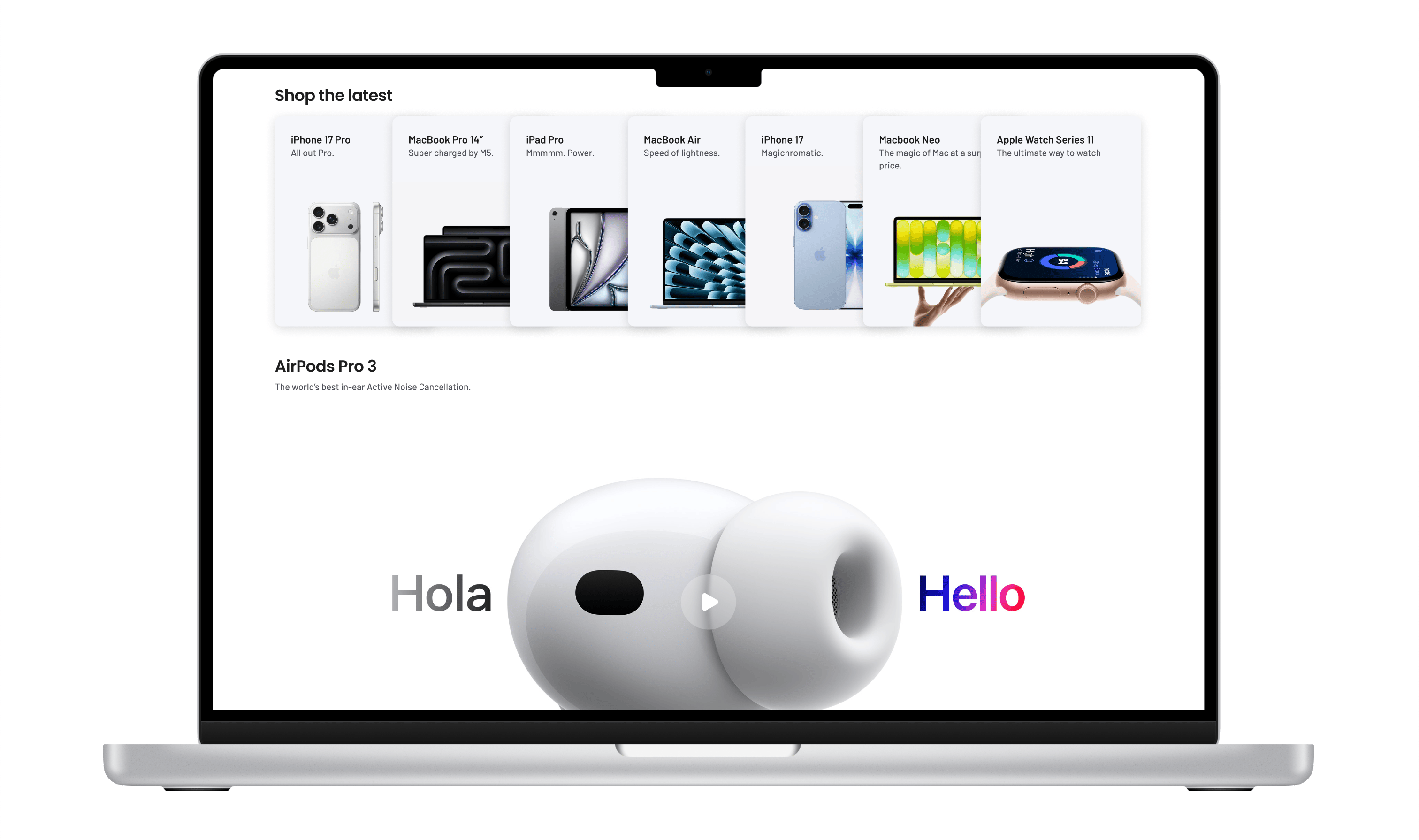
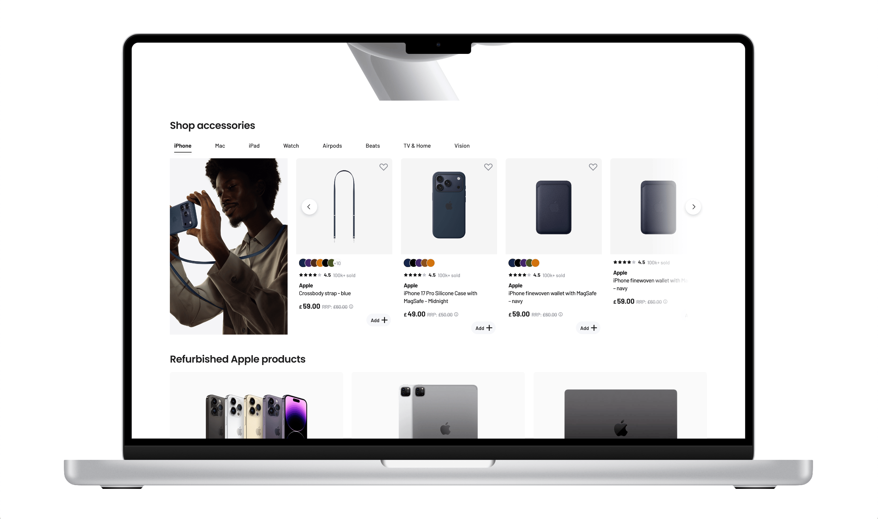
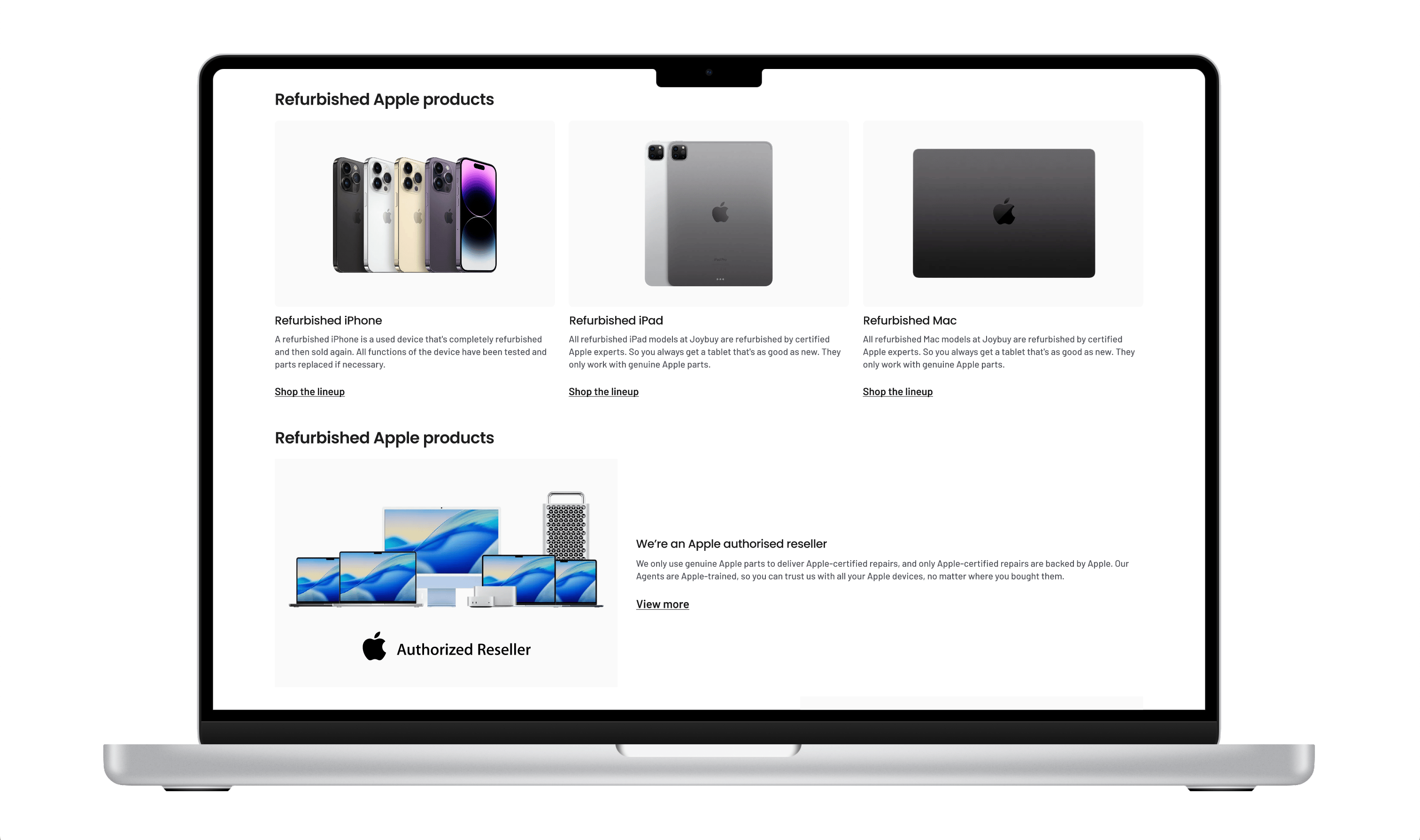
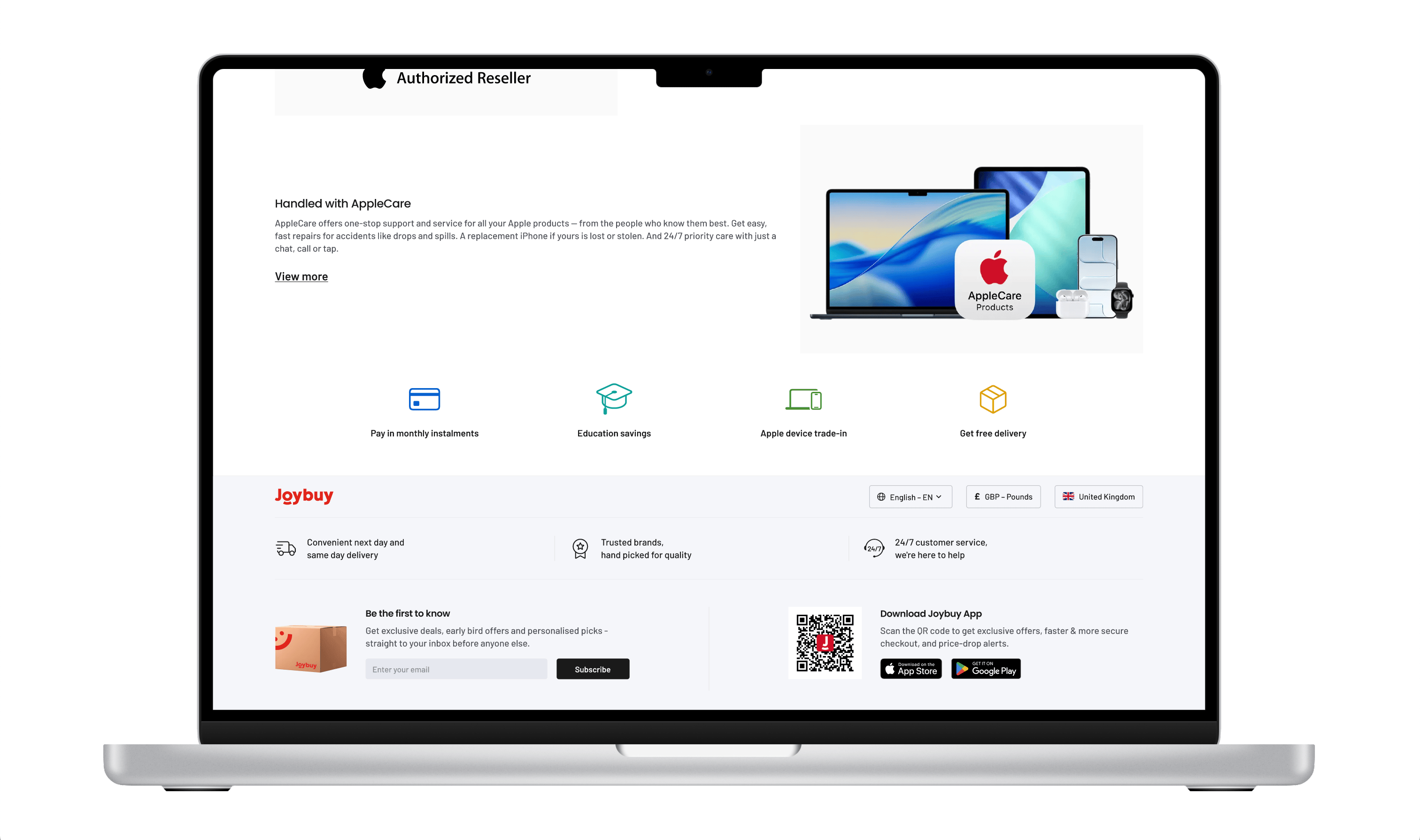
Renovated Apple flagship store
[Right] My three-dimensional discovery framework.
Why usability audit
With the live SiS pages providing a real baseline, I used a usability audit as an entry point to assess where the existing experience made it harder for users to understand the journey, browse effectively, and make decisions.
Before
Making the system easier to use and harder to break
I simplified setup by reducing repetitive module combinations and introducing clearer hierarchy and usage rules. Since storefronts were configured by non-design teams, I also made the templates more fault-tolerant, so the system could handle edge cases and inconsistent usage without breaking the experience.
Category-specific browsing experience
Instead of one template for all partners, I defined browsing logic per category: Beauty by concern and editorial, Electronics by specs and service, Toys by age, theme, and interest. The result wasn't a single page, but a CMS-aware, category-specific SiS system built for the UK & EU market.
Adoption / activation
32% increase in active storefronts post-launch.
Operational efficiency
~2 fewer revision rounds between brand partners and Joybuy team.
23% reduction in product-team involvement per storefront setup (non-design teams self-serving).
Commercial / performance
Uplift in storefront traffic, CTR on guided entry points, and add-to-basket rate on category-led discovery.
26% reduction in time-to-launch for a new storefront.
(from ~3.2 weeks to ~2.4 weeks).
SiS revamp timeline
© Olivia Forster, 2026